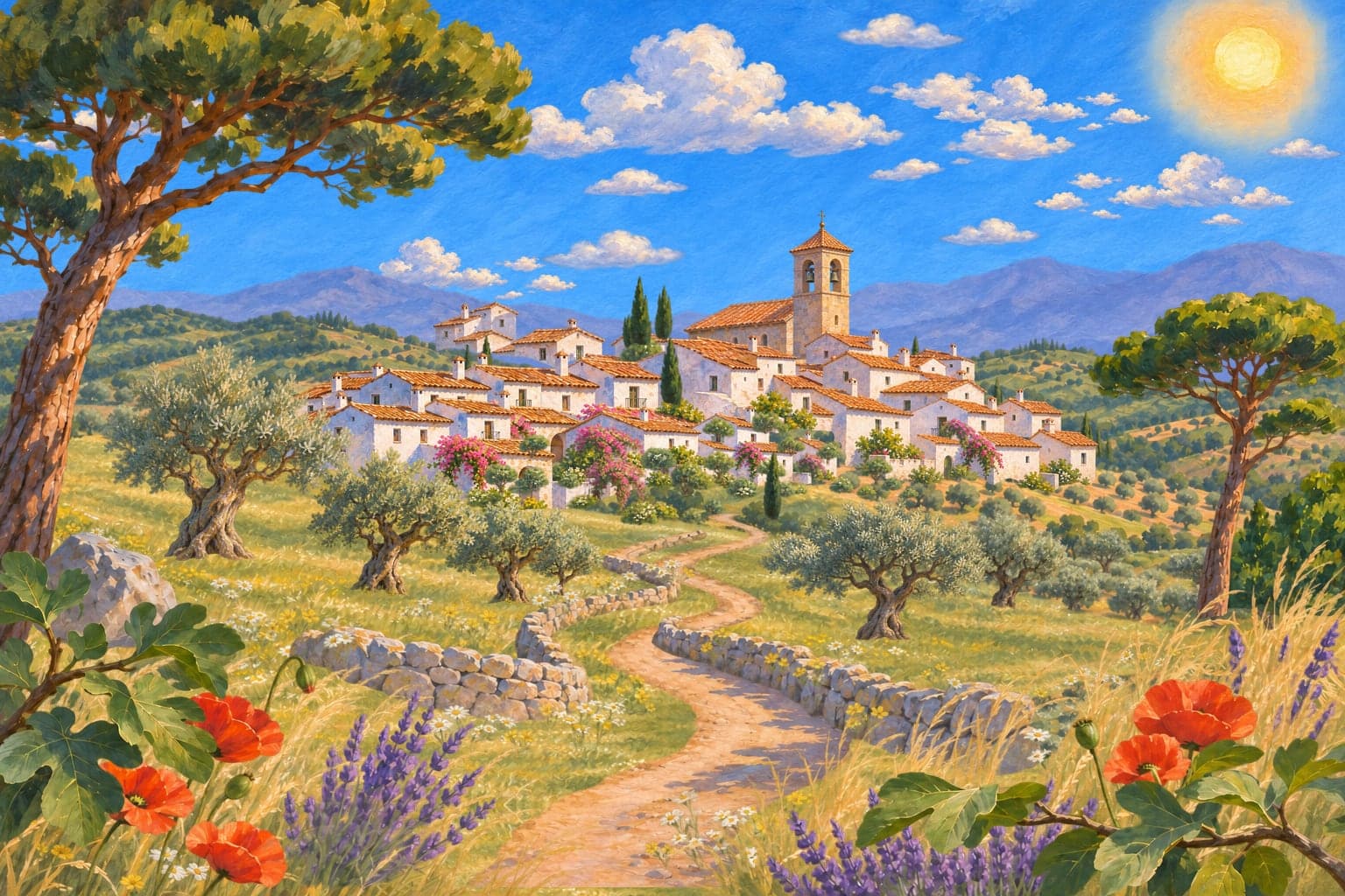
2.5D multiplane parallax
A scroll-driven demo of the multiplane technique: one painted village cut into over 50 flat transparent layers, a camera that travels forward through them. Below it, a short guide for anyone exploring the idea.
What is a multiplane parallax effect?
A multiplane parallax effect, often called 2.5D, builds a scene from several flat transparent images placed at different distances from the viewer. When the camera moves, each layer moves by a different amount, so a flat illustration reads as a three-dimensional world. No 3D models are involved, only artwork and transforms.
The idea comes from the multiplane camera, developed at Walt Disney Studio in the 1930s. Painted glass planes were stacked under a camera and the camera moved toward them, so foreground, middle ground and background shifted at different speeds. The Old Mill (1937) and Snow White and the Seven Dwarfs (1937) used it.
How it works on the web
Every layer has a distance from the camera. As the camera moves forward, a layer at distance z is drawn at a scale of z divided by what is left between it and the camera. Nearby layers grow quickly and sweep out past the edges of the screen, while distant layers barely change. Sideways movement works the same way: nearer layers slide further.
The page pins one full-screen scene and ties the camera to scroll progress, so scrolling feels like travelling forward instead of moving a page upward. This demo is built with:
- Transparent WebP or AVIF layers, all on the same canvas size and aligned
- CSS transforms (translate3d and scale) and opacity only
- One requestAnimationFrame loop that writes straight to the DOM
- position: sticky for the pinned scene, with no scroll hijacking
- No WebGL, no Three.js and no animation library
Multiplane parallax versus ordinary parallax scrolling
Classic parallax scrolling moves backgrounds at different vertical speeds. It is easy, but it stays flat: nothing ever gets closer. A multiplane scene moves the camera through the layers. Foreground elements scale up and leave the frame, buildings grow, and distant mountains stay put. That is the difference between sliding pictures and travelling through a place.
How to prepare artwork for a 2.5D scene
The artwork matters more than the code. A few rules make the effect convincing:
- Split the scene into 4 to 7 depth groups, for example sky, distant mountains, hills, buildings, trees and foreground.
- Export every layer on the same canvas size, aligned, with transparency wherever nothing should show.
- Paint beyond the edges and behind overlaps, so movement never reveals a gap.
- Build atmospheric perspective into the art: far layers lighter, bluer and softer, near layers darker and more saturated.
- Use optimised WebP or AVIF, and serve a flattened poster for the first paint.
Performance, accessibility and SEO
A 2.5D scene should be fast and still usable. Animate only transform and opacity, run one animation loop and pause it when the scene is off screen. Ship a flattened poster image first, so the largest paint is a single request, and load the layers afterwards.
Simplify the motion on phones, respect prefers-reduced-motion and keep every word of text in the HTML, so search engines and screen readers read the page the way a visitor does. Give people a way to skip the scene.
When to use it, and when not to
It works well for hero scenes, product launches, portfolios, campaign pages and brand storytelling, where one strong visual carries the message. It is a poor fit for dense content, checkout flows and anything people scan quickly. Keep it to one scene per page.
Questions people ask
Is 2.5D the same as 3D?
No. A 2.5D scene is made of flat images arranged in depth. There are no 3D models, lights or geometry, only layers, scale and movement, which is why it is light enough for an ordinary website.
Do I need Three.js or WebGL?
No. CSS transforms and a small animation loop are enough. They are cheaper on battery and easier to make accessible than a 3D engine.
How many layers should a scene have?
For most pages four to seven depth planes is plenty: fewer feels flat, more adds weight. This demo is deliberately a showcase. It cuts the painting into over 50 small cut-outs (the bell tower, houses, trees, flowers, clouds) sorted into six depth groups, and stays light because each cut-out is cropped to its own shape instead of being a full-screen layer.
Will it slow my website down or hurt SEO?
Not if it is built carefully: a flattened poster for the first paint, layers loaded afterwards, only transform and opacity animated, and all text kept in the HTML.
Does it work on phones?
Yes, in a simpler form. Scroll-driven travel works with touch, while pointer effects are switched off and the movement is reduced. Visitors who prefer reduced motion get a still version.
Can Mediseo build something like this for my site?
Yes. We design the artwork, build the scene and tune it for speed and accessibility. Book a free chat and we will tell you honestly whether it suits your brand.